Principle Component Analysis
Introduction
Return to Top This is the intro
Principle Component Analysis
This section applies Principal Component Analysis (PCA) on LIBOR interest rate and shows that the first 3 principal components correspond to term structure, slope, and curvature, respectively. For purpose of this study, I will emphasize my analysis on before and after the housing bubble. Therefore, I will change the data range from 2007 to 2012. So I when I extract the data from FRED website, I will change the date_range to ‘200701/201112’.
Principle component analysis is done on stationary data. Consequently I will create a master dataframe (USD_1D_comb) that cbinds all the 1 day increment data obtained from previous section:
USD_1D_comb<-cbind(USDON_1D,USD1M_1D,USD3M_1D, USD6M_1D, USD9M_1D,USD12M_1D)
colnames(USD_1D_comb) <- c("OverNight","1Month", "3Months", "6Months", "9Months", "12Months")
# computes the PC score for each data point
USD_1D_comb <- USD_1D_comb[complete.cases(USD_1D_comb)]
# computes the PC rotation for each maturity
USD_1D_pca <- prcomp(USD_1D_comb,center=TRUE,scale=TRUE)
# get the summary of the PCA
summary(USD_1D_pca)
str(USD_1D_pca)
# Plot a bar plot to show the importance of each component:
Var_1D=summary(USD_1D_pca)$importance[3,]
Var_1D=data.frame(Var_1D)
A=ggplot(data=Var_1D, aes(x=index(Var_1D), y=Var_1D*100)) +
    geom_bar(stat="identity")+
    xlab('Principle Components') +
    ylab('Cumulative proportion of Variance')+
    scale_x_continuous(breaks=1:6, labels=c("PC1","PC2","PC3","PC4","PC5","PC6"))+
    theme(axis.text=element_text(size=12, colour = "black"))+
    theme(axis.title=element_text(size=12, face="bold", colour = "black"))+
    ggtitle("1 Day Increments")+
    theme(plot.title = element_text(face='bold', colour='blue',size=30))
print(A)

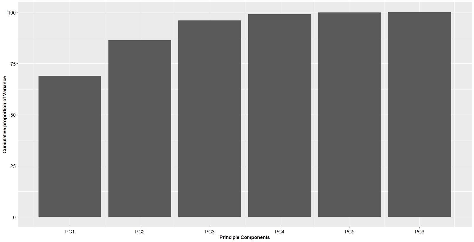
Indeed, the first principal component accounts for 69.0% of variance, with the second principal component getting 17.4% and the third 9.5%. The first 3 principal components account for, cumulatively, 95.9% of all movements in the data. Hence, in terms of dimensionality reduction, the first 3 principal components are representative of the data.
Below is the code on how to obtain the Eigenvectors and how to plot them for each principle component.
EV_1D=data.frame(USD_1D_pca$rotation)
B= ggplot(EV_1D)+
  geom_line(aes(x=index(EV_1D), y=PC1, col='PC1'), size=1)+geom_point(aes(x=index(EV_1D), y=PC1))+
  geom_line(aes(x=index(EV_1D), y=PC2, col='PC2'), size=1)+geom_point(aes(x=index(EV_1D), y=PC2))+
  geom_line(aes(x=index(EV_1D), y=PC3, col='PC3'),size=1)+geom_point(aes(x=index(EV_1D), y=PC3))+
  scale_x_continuous(breaks=1:6, labels=c("OverNight","1Month", "3Months", "6Months", "9Months", "12Months"))+
  xlab("Maturity")+
  ylab("EigenVectors")+
  ggtitle("Eigenvectors")+
  theme(axis.text=element_text(size=12, face="bold", colour = "black"))+
  theme(axis.title=element_text(size=14, face="bold", colour = "black"))+
  theme(legend.position = c(0.9, 0.9))+
  theme(legend.background = element_rect(fill="lightblue", linetype="solid", colour ="darkblue"))+
  theme(legend.title=element_blank())+
  theme(legend.text=element_text(size=14))+
  theme(plot.title = element_text(face='bold', colour='blue',size=30))
print(B)

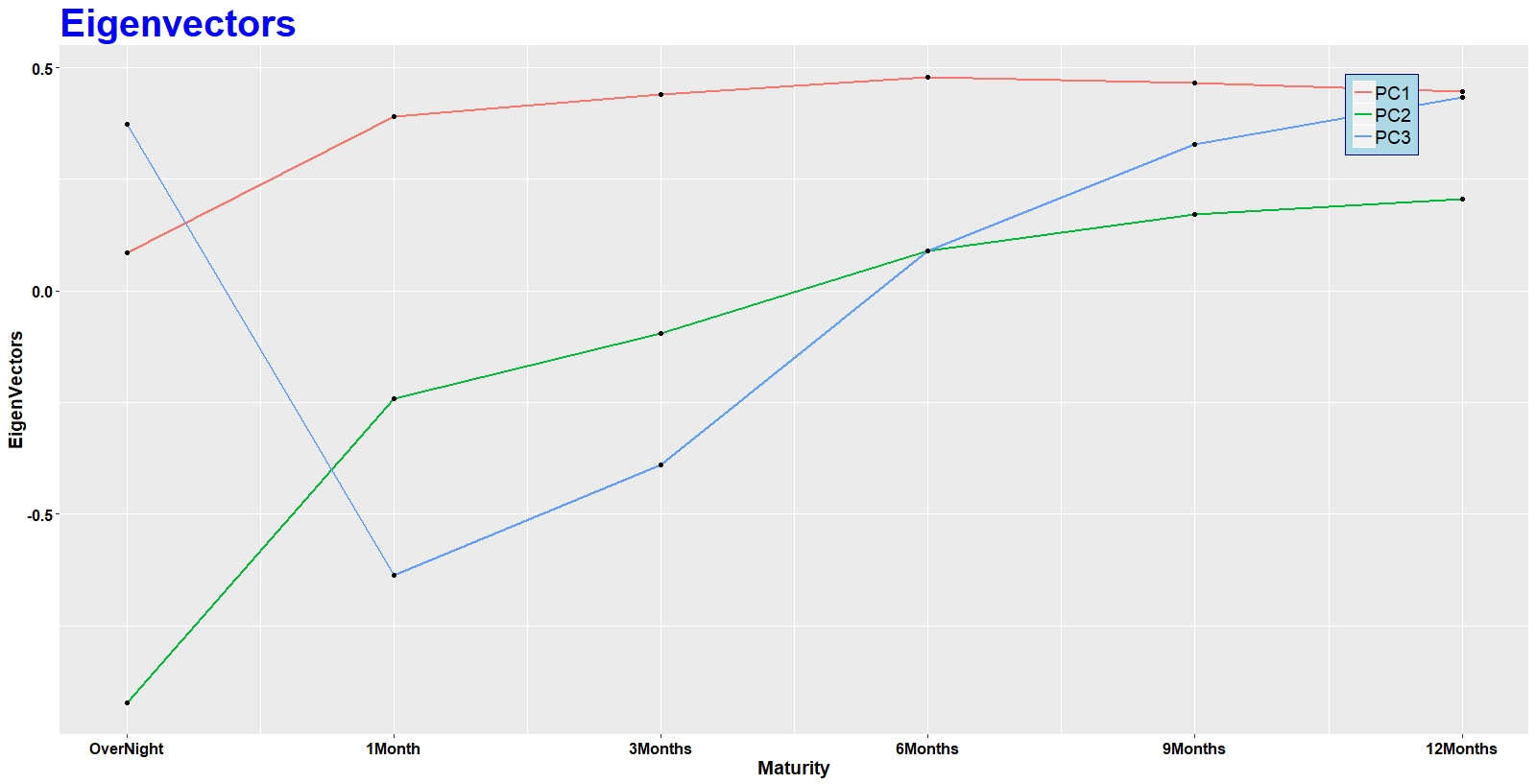
The first principle component reflects the directional movement in the term structure. If the interest rate of one maturity goes up, interest rates for the rest of the maturities also go up. This means that all interest rates are weighted in the same direction (positive for our case, but the sign is arbitrary).
Principle component two corresponds to the slope of the term structure. These are movements that steepen or flatten the entire term structure. Looking at the eignevector of PC2, one can see that when the short term (e.g. over night) values are low, the long term (e.g. 12 Month) values are high. And since the signs are arbitrary, this means that when the short term values are high, the long term values are low. This is exactly what the slope of the term structure represents. If the term structure curve steepens, the short term goes down and the long terms go up and vice versa.
The third principle component represents movements that change the curvature of the entire term structure. Since the signs are arbitrary, this means that PC3 illustrates movements that cause the short term and long term to go in one direction, and the middle terms to go in the other.
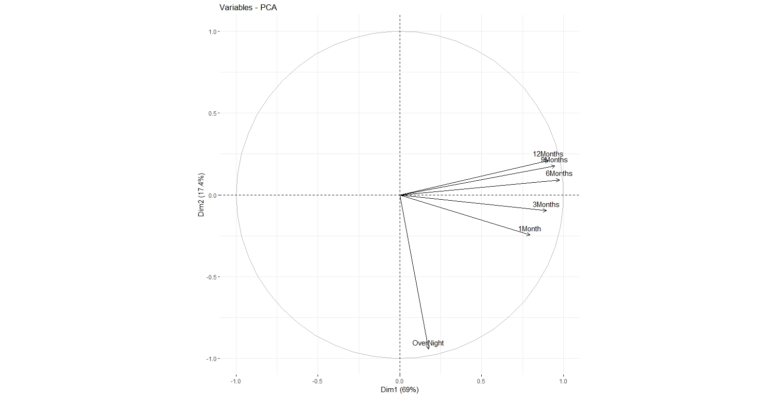
In summary, PC1 can be interpreted as directional movements, PC2, as slope movements, and PC3 as curvature. PC1 and PC2 can also be visualized through biplot:
fviz_pca_var(USD_1D_pca)
 The x axis is PC1, and y axis represents PC2. One can see that all of the maturities are all in right side (sign is arbitrary) of the graph with respect to PC1, meaning that if the interest rates of one of the maturities increase, the rest will increase too and vice versa. Also, Overnight, 1 Month, and 3 Months maturites are in the negative side and 6 Months, 9 Months, and 12 Months maturities are on the positive side with respect to y axis (or PC2). meaning that if the short terms (Overnight, 1 Month, and 3 Months) increase, the long terms (6 Months, 9 Months, and 12 Months) decrease, and vice versa.